Tutorial: driving the network-plotting API directly
This notebook skips the GUI’s Network Viewer tab entirely and calls
meanap.network_plot directly — the same module that tab uses underneath.
It’s the fastest way to script batch figure generation, or to build a custom
plot MEA-NAP doesn’t produce out of the box.
The data file used here, sample_data/NGN2_20230208_P1_DIV14_A2_OutputData.mat,
is a real MEA-NAP Python-port output file (from the same NGN2_..._A2
recording used as one half of the bundled “Test pipeline” example dataset —
see Quickstart) — every number in this notebook’s plots
comes from an actual pipeline run, not synthetic data.
import numpy as np
import matplotlib.pyplot as plt

from meanap.network_plot import MatData, plot_network

data = MatData("sample_data/NGN2_20230208_P1_DIV14_A2_OutputData.mat")

print("Available lags:", data.lag_keys)
print("Available node-level metrics:", data.available_node_metrics)
print("Total electrodes in layout:", data.coords.shape[0])
---------------------------------------------------------------------------
ModuleNotFoundError                       Traceback (most recent call last)
Cell In[1], line 4
      1 import numpy as np
      2 import matplotlib.pyplot as plt
      3
----> 4 from meanap.network_plot import MatData, plot_network
      5
      6 data = MatData("sample_data/NGN2_20230208_P1_DIV14_A2_OutputData.mat")
      7

ModuleNotFoundError: No module named 'meanap'
Inspect one lag
Each STTC lag value has its own adjacency matrix and its own set of active nodes (electrodes that passed the minimum-activity filter for that lag).
lag = data.lag_keys[0]
print("Using lag:", lag)

active_idx = data.get_active_indices(lag)   # 0-based indices into the full 64-electrode array
adjM = data.get_adjM(lag)[np.ix_(active_idx, active_idx)]
coords = data.coords[active_idx]

print("Active nodes:", len(active_idx), "/", data.coords.shape[0])
print("Adjacency matrix shape:", adjM.shape)
Using lag: adjM10mslag
Active nodes: 62 / 64
Adjacency matrix shape: (62, 62)
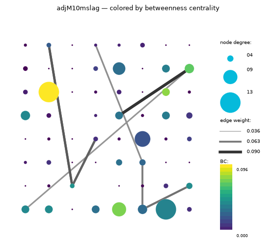
Plot the network, colored by betweenness centrality
Node size is node degree (ND); node color is betweenness centrality
(BC), using the same viridis colormap and legend the Network Viewer GUI tab
renders.
z = data.get_metric(lag, "ND")    # node degree -> node size
z2 = data.get_metric(lag, "BC")   # betweenness centrality -> node color

fig, ax = plt.subplots(figsize=(7, 6))
plot_network(
    ax, adjM, coords,
    edge_thresh=0.05,
    z=z,
    z2=z2,
    z2_name="BC",
    title=f"{lag} — colored by betweenness centrality",
)
plt.show()
Compare across lags
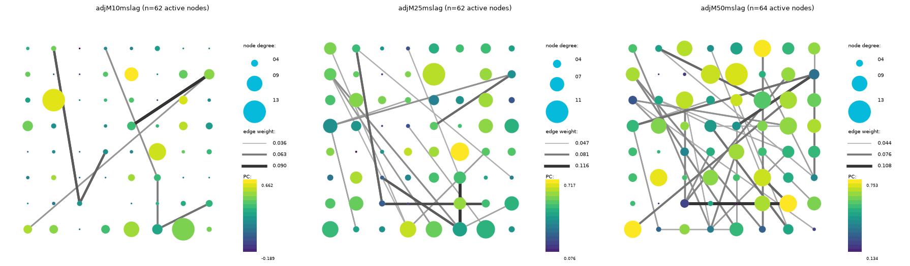
Looping over data.lag_keys makes it straightforward to generate one figure
per lag value — useful for a quick side-by-side sanity check before diving
into the full report.
fig, axes = plt.subplots(1, len(data.lag_keys), figsize=(6 * len(data.lag_keys), 5))

for ax, lag in zip(axes, data.lag_keys):
    active_idx = data.get_active_indices(lag)
    adjM_lag = data.get_adjM(lag)[np.ix_(active_idx, active_idx)]
    coords_lag = data.coords[active_idx]
    z = data.get_metric(lag, "ND")
    z2 = data.get_metric(lag, "PC")

    plot_network(
        ax, adjM_lag, coords_lag,
        edge_thresh=0.05,
        z=z,
        z2=z2,
        z2_name="PC",
        title=f"{lag} (n={len(active_idx)} active nodes)",
    )

plt.tight_layout()
plt.show()
Next steps
Swap
"BC"/"PC"for any metric indata.available_node_metrics— node strength (NS), module z-score (Z), local efficiency (Eloc), or the controllability metrics (aveControl,modalControl) all work the same way.To overlay cell-type information (e.g.
NeuN+/PV+markers), see Network Viewer — the sameload_cell_type_file/build_cell_type_matrix/filter_by_cell_typesfunctions used there are importable frommeanap.network_plottoo.For the full function/class reference, see the API reference.